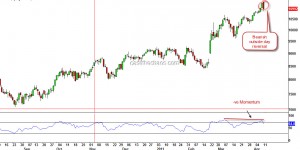
Jun 302011
 

I'm posting this update on Nifty from my holiday spot in Bangkok, so this will be short.

Nifty - Daily Charts

On the charts above, note those small violet squares (you may want to click on the chart for a zoom) that mark the swing highs and lows. This is how waves progress, each move moving beyond the extremes of the previous move and in a five step fashion. So, I'm treating the current move as a corrective move to the decline of 5944 to 5195 and not as a trend change. If you heard me on CNBC on 20th June, the day markets hit 5195, I had expected a reaction to 5485 but this one has been stronger than that. Nevertheless, it would have prepared you to go slow on the bearish side.

Going ahead, the rise from the June 20th low should remain "a three" for the bearish case. Hence, we should expect Nifty to start reacting lower from the red trendline marked on the chart (5720 and falling by 5 points each trading session) - which would raise the prospects of a descending triangle OR react lower from 5660's. Either case, I would NOT put my feet back on the bearish pedal atleast till I see a lower high registered. I have plotted a couple of possible routes on the chart.

Signing out, until my next update from Singapore - man, its really hot here!

Jun 212011
 

In yesterday's market action, India's Nifty breached an important trendline in a convincing fashion. All the corrections since Nov 2009 stopped right at this trend-line (see chart below) and kept the up trend intact.

Nifty breaches a 20 month trend-line

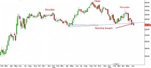
The weight behind this breach was ONGC, which also happened to complete a Head and Shoulders top on its weekly chart.

ONGC completes a head and shoulder pattern

Though Nifty is yet to break the February low of 5177, considering the fresh weakness in top four Nifty stocks (ONGC, Reliance, TCS, Infy), it looks like it would just be a matter of days before this level is violated. Relief rallies if any, are likely to come under pressure between 5400-5485.

Jun 142011
 

The Nifty has been in the range of 5600 to 5400 for the sixth week and has kept everyone guessing as to which way the range would resolve. As a good trader, one needs constantly play devil's advocate to your own views. So, here are the charts that present both the bullish and the bearish views.

If you are a bull:
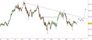
Nifty - Daily Charts - as the bulls would like to read

The above Elliot wave count assumes that the November high was only a portion of a larger bull run and further gains are yet to follow. The violet wave 1 ended at the November highs and the subsequent decline into the January lows of 5177 completed the corrective wave violet 2 (which sub divided as a zig-zag red ABC).  This would mean that the move to the May high was wave 1 green (impulsive)  and is part of the powerful wave 3 violet which is likely to reach levels way beyond the all time highs.

Line in sand - If Nifty dips below 5320 it would weaken the bullish case though only a breach of 5177 would completely negate this option.

What's in favour? - Despite the global and regional weakness, India has been holding up well in the last few days.

What's against? - Reliance and ONGC ,the two heavy weights, are showing weakness. A big negative pattern  is under construction in ONGC. The assumed wave count to the May highs is a truncation - which normally does not help the case. The blue dotted trend-line shown is also likely to place a lid on the upward move.

If you are a bear:
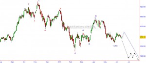
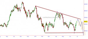
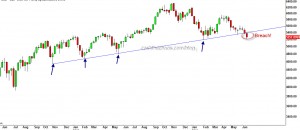
Nifty - Daily Chart - as the bears would like to read

The bearish case has multiple options and I have taken the least bearish option. If we assume the November high was the end of violet wave 1, the decline into the January lows was only part of a larger correction Violet A, that sub-divided into red ABC. The rise into May high is assumed as corrective in nature, Violet B (which again sub-divided as blue ABC). The ongoing move from the May high is part of the Violet C wave decline which is expected to sub divide in to 5 waves. Of this 5 waves we have probably completed the first wave of the decline (blue 1 of Purple C) and we are the beginning of a powerful wave 3 (blue 3 of purple C) that would take market below 5000 (black arrows) or the corrective wave 2 is yet to complete(blue dotted path) before the powerful blue 3 of purple C takes Nifty well below 5000.

Line in sand - A move above 5650 would weaken the bearish case though only a breach of 5944 would force us to suspend the bearish bets.

What's in favour? - Exactly what is against the bullish case favours this - ONGC and Reliance. Also, the Dollar Index seems set for a powerful move that is likely to unleash a destructive move on most risk assets across the globe.

What is against? - Nifty has not managed to consolidate on the advantage of taking out the March lows and move briskly below the January lows.

PS: If you would like to know which side i'm leaning - i've been on the bearish side since November and I continue to do so.
Jun 092011
 

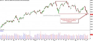
The decline over the past few weeks has started to signal a top in some of the equity markets around the world. The Canadian TSX is one of those.

The chart above shows a confirmed double top for the Canadian TSX composite index. By conventional measuring techniques and by  Elliot wave principle this index should decline to 12300-11000 over the next several weeks from its current level of 13183.

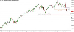
The US S&P's decline below the April low is starting to resemble like the beginning of a powerful third wave. I expect a short-term bounce that relieves the oversold state and gets met with strong supply under 1311 S&P. If that happens expect the lows of  1248 (the post earthquake low ) to give way and the 1173-74 level will draw prices towards it. The next few days are key to this view.

Bottom Line: The global markets structure has started to weaken - The Russsian RTSI after a head and shoulder top in May is declining steadily; the Brazilian Bovespa has been clocking lower tops and lower bottoms since November just like the India Nifty (though this is marginally stronger in relative terms) ; the Shanghai Index too has been taking it on its chin since April.

 Posted by at 7:11 am
May 062011
 

Just one day  prior to the anniversary of Dow's 1000 point crash, the Ghosts of the 'flash crash' came back to haunt risk assets with greater ferocity. Crude got walloped by 10%, Gold got slammed by over $50 and Silver was decimated by another 12% on top of its recent sharp drop!!

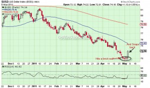
The force behind this move is the Dollar Index, which until now had refused to head higher despite being heavily oversold on multiple counts.

Dollar Index - Daily Chart

If you look the charts of UUP, the bullish dollar index fund, the 1.5% rise for this currency basket has come with a massive buildup in volumes. Also a gap up in UUP after a congestion holds the probability that the gains could stick and could even be a reversal.  A follow through in Friday' session for the USD would bode well for those rare Dollar Bulls. One thing that is quite clear, if this is not the reversal for the green-back, whenever it occurs, what we saw in yesterday's session is a mere curtain-raiser of things to come for risk assets.

Looking at the charts of Gold and Crude, there is more evidence that this is probably a turn of high significance for the intermediate to long term.

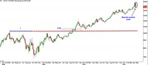
Gold: The weekly charts of Gold will end up being a bearish outside week (unless it recovers $40 in today's session) and this high probability reversal has occured at a very important time ratio as shown in the chart.

Gold - Bearish reversal

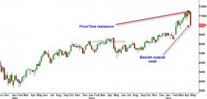
Crude: A bearish outside week in crude and  Price/Time have squared at the high.

Crude - weekly charts

Apr 272011
 

Silver's sharp decline after hitting a multi-decade high warrants close attention.

Silver- Daily Charts

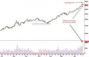
The daily chart of silver above marks the "long-legged doji" which is a key warning of sign of an impending reversal. Moreover this pattern (a) has occurred after a prolonged and parabolic rise in silver (b) has seen follow through selling on very heavy volumes and (c) has faced resistance at the 1980 highs. These are mouth-watering signs for much lower prices for silver.

However I will probe this set up with a very small short trade - the Dollar Index has shown no signs of reversal and is merely consolidating near the lows. Unless the green-back turns up this might turn out to be just a fleeting drop in an up-trend.

Apr 132011
 

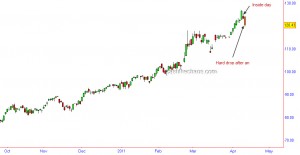
Brent Crude had formed an 'inside day' and it has now exceeded the range of this inside day, dropped hard to the downside. So, there is a high degree of probability that there is an intermediate term reversal in crude.

Brent - Daily Charts

Reversal in Crude?

 Commodities  Comments Off on Reversal in Crude?
Apr 122011
 

The daily charts of Nymex Crude registered a very important price action which could potentially mark a trend reversal. In technical parlance this is called a bearish outside day or a bearish engulfing candle.

Momentum readings have also diverged negatively with this occurrence and the number of contracts that accompanied this sell-off also ticked up (a nice to have). Now why should you pay attention to this? Besides the fact that the 2008 reversal was also a bearish outside day, I'm sure you would have heard and seen reports of $200+ crude over the last few weeks flying thick and fast. Essentially, it is a very crowded trade.

Now if crude does come down, do not be mislead into thinking that a falling crude may be the new impetus for stocks. If this is indeed a reversal for Crude, stocks are also likely to start a new downtrend or resume the previous down draft depending on which markets you are focussing on. Here is an interesting snippet regarding crude from one of my past interviews:

httpv://www.youtube.com/watch?v=hJuWU1GEYD0

As a reality check, let me also add that I do not see such a reversal in Brent Crude. It would have been another nice to have and would have added more weight to the reversal.

Apr 102011
 

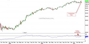
Last week, TCS hit new life time high on Tuesday but by the end of the week the stock closed under the previous high of 1220. The chart below is the weekly chart of TCS showing a 'gravestone doji'  formation suggesting supply is starting to over-power demand. The bottom panel also shows momentum diverging negatively with the price movement.

TCS - Weekly Chart

Drilling down to it's daily chart, it is quite clear that when TCS clocked new highs, there was not any significant volume expansion. The stock was not able to sustain above it's previous high of 1220 for more than a day and has continued to move lower. This price action is looking more like a head-fake rather than a true breakout. Now, if you are a conservative trader, you can wait for the breach of 1125 to book out longs and reverse direction. An aggressive approach would be to turn bearish below last week's low of 1184 with a stop placement above 1220 or 1247.

 Posted by at 4:52 pm  Tagged with: