Apr 102011
 

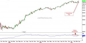
Last week, TCS hit new life time high on Tuesday but by the end of the week the stock closed under the previous high of 1220. The chart below is the weekly chart of TCS showing a 'gravestone doji'  formation suggesting supply is starting to over-power demand. The bottom panel also shows momentum diverging negatively with the price movement.

TCS - Weekly Chart

Drilling down to it's daily chart, it is quite clear that when TCS clocked new highs, there was not any significant volume expansion. The stock was not able to sustain above it's previous high of 1220 for more than a day and has continued to move lower. This price action is looking more like a head-fake rather than a true breakout. Now, if you are a conservative trader, you can wait for the breach of 1125 to book out longs and reverse direction. An aggressive approach would be to turn bearish below last week's low of 1184 with a stop placement above 1220 or 1247.

 Posted by at 4:52 pm  Tagged with:
Mar 282011
 

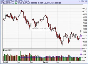
The 2.3% bump UP for the Nifty on Friday was quite smooth and brought a lot of cheer on the streets but the CRITICAL 5690 level still remains unconquered. Given the smart rise of the previous week, it may not seem formidable after all. Nevertheless, we will have to wait and see what the market does. So, let us do a what if scenario.

a) What if 5690 is taken out - the bullish case. The market structure that we thought was unravelling in this post would not be the case and markets would continue to head higher. The problem here is, the market has spent more days between 5600 and 5200 than it took to decline from 6182 to 5177. So it is looking more like a short-term bullish picture. And the question - How much higher? It could be around the region of 5900 but may not be much higher.

b) What if 5690 is not taken out - the bearish case. Obviously the old targets would still be alive while we may still have to see if we need to slightly review the market structure. But the markets need a quick decline - the longer Nifty holds above 5600, the odds of the bears losing advantage would increase.

A couple of  things that needs to pointed out here. Firstly the volume of the short-term breakout did expand slightly, it was nothing exceptional as the media is projecting it to be (see the horizontal blue line on charts).

Nifty - Daily Charts

Secondly, while the small caps and mid-caps tend to follow the large caps, they are yet to clock higher highs - risk taking is not yet back, at-least so far.

Mar 202011
 

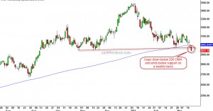
If you thought the key price action of last week's trading activity in the Indian bourses was Reliance's drop on Friday, that is not entirely true. The CNX IT index's steady price erosion over the last week is actually more important.

CNX IT Index - Daily Chart

All through the corrective declines since the March 09 bottom, not once did this index drop below the 200 DMA. Yet another, sign that this is not a mere correction.

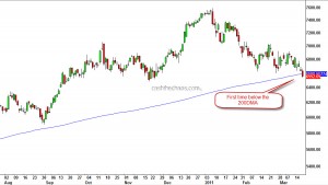
Infosys, the technology heavy weight has an interesting price chart.

Infosys - Daily Chart

The stock gapped below its 200 day moving average on Thursday and ended the week firmly below this level.

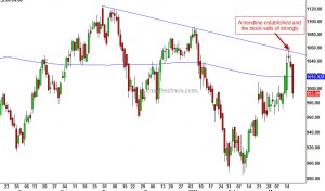
Reliance the stock on which the hope's of the bulls are pinned, established a firm downward sloping trendline and the stock has started to drop strongly.

Reliance - Daily Chart

While the talk of the week was the apparent resilience of the Indian market during a crisis , it was actually the bears who were scoring.  This is the first time since 2008 that all the sectoral indices  are trading below their respective 200 DMA!!

Feb 282011
 

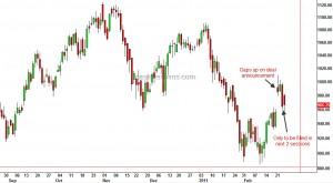
When Reliance announced the deal with BP there was quite a bit of excitement amongst the analyst community. Some even thought this was a game changer for the stock. But here is the stock dipping under the pre-deal announcement levels.

Reliance - Daily Chart

If the stock closes Rs 10 under Friday's close, the deal essentially would mean nothing for the stock! What is quite obvious from the chart is that the gap resulted on February 22nd is nothing but a common gap and has very little potential, if any, to reverse the down-trend of the stock.

Feb 182011
 

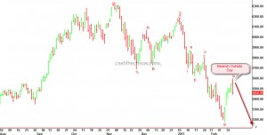
The relief rally for the Nifty that began from the lows of February 11th, ended today with a strong reversal bar. As can be seen from the chart below, today's price action shows a rejection of the early highs and sellers have overpowered the buying pressure of the previous day too. This bearish outside day is marked on the chart.

Nifty - Daily charts

If my Elliott wave labelling is correct, Nifty should decline to a minimum of 5115 in the near term - could be even as quick as 2 weeks or less.

Keep these stock on your watchlist

 Indian Market/Stocks  Comments Off on Keep these stock on your watchlist
Jan 132011
 

The first one is the heavy weight ONGC

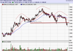
ONGC Daily Charts

IMO, this is not a perfect H&S top, as the volumes have not been supportive of the dip below the neckline. Nevertheless,  due to its high weightage in Nifty and fact that the stock is clocking lower highs and lower lows, it deserves our close attention.

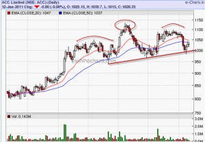
Next is the cement major, ACC.

ACC Daily Charts

A close below the 1000 level with expanding volumes would give the bears the upper hand in this sector.

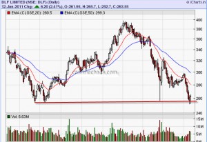
The third one is the real estate major DLF.

DLF Daily Charts

The stock is hanging by a fingernail above its major support of 255. Although DLF did dip below that level on an intraday basis, it managed to close above that level and averted a major disaster here.

If any of these stocks close below the levels marked here, the bears will have more ammunition to launch their assault on the broader market.

Week No1 of 2011 to Bears

 Indian Market/Stocks  Comments Off on Week No1 of 2011 to Bears
Jan 102011
 

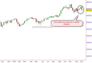
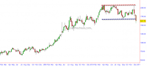
The bears have covered considerable ground in the first trading week of the new year. Indian markets are clearly the worst performer amongst its global peers. The grizzlies have managed to plough into the gains of the past 3 weeks and handed in a loss of 3.75% for the Nifty and 4% for the Sensex.

Nifty Weekly Charts

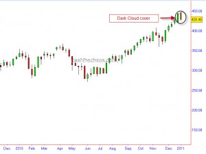
An important development has been in the price action of copper - an ominous dark cloud cover formation (If you are a P&F chartist, a high pole warning). Although a follow through sell off week is needed here before conclusions can be drawn about the extent of the damage, copper is deemed to have a doctoral degree due to its ability to pinpoint key market turns. Hence, this chart remains the key market to focus this week to gauge the health of the global equity indices.

Copper - DCC on weekly charts

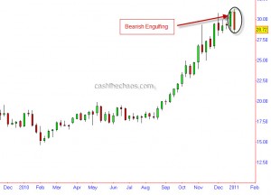
Yet another market where bears have made serious inroads last week has been in the precious metals space. While Gold's stumble around the $1425 level for the third time may be obvious to many, Silver the key out performer in this printed run to prosperity, has logged some substantial loss.  A reversal signal on weekly charts, a "bearish engulfing" pattern is a high probable indication that the run here is coming to an end at least for the intermediate term, if not for the longer term.

Silver - Bearish reversal sign on weekly charts

 Posted by at 4:28 am
Dec 152010
 

Hero Honda - Weekly Chart

The weekly charts of Hero Honda shows the obvious resistance at 2100. After failing to clear this level for the third time, the stock has plunged below the previous support.  A normal measured move for the above kind of  price action would be a move to somewhere around 1100 (the width of the previous price band). If you are an Elliot Wave fan, one can also count clear 5 waves to the highs and the current move is probably C leg or wave 3 to the downside.

So unless there is an immediate reversal with volumes, this might be just the beginning of a bigger fall for the stock. The stock is oversold in the short-term and may see a bounce to 1700's.

Red Alert: Five Charts and their implications

 Commodities, Indian Market/Stocks  Comments Off on Red Alert: Five Charts and their implications
Nov 292010
 

A couple of  weeks back I had posted a note on my own derived indicator and highlighted how important it was for the indicator to hold above the previous trough. On Friday, this indicator dipped below the previous trough on a closing basis and has warned that the Indian markets have probably peaked and a bearish phase is a very distinct possibility. So naturally one has to ask - how has this indicator fared in the past?
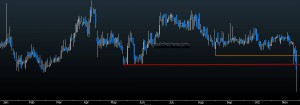
Indian economy barometer

This indicator has a commendable track record over the last 10-12 years:

1) In 1999 - the indicator peaked in Oct 1999, and warned of a bear market a few weeks before Sensex and Nifty peaked.

2) Likewise in 2003 when the Sensex/Nifty bottomed in April, this indicator was a few months ahead signalling an impending new bull market (some might consider Oct 01 as the bottom for the Indices, even then this indicator was ahead)

3) In 2006, during the infamous sharp drop in May this indicator stood its ground.

4) In Oct/Nov 2007, this indicator warned of an oncoming bear market.  The Indian markets peaked in Jan 2008.

It is often a good idea to look at other inter-related markets before coming to a conclusion about a major trend-shift. And here is where the fixed income /bonds come into the picture. Here is a chart of the 10 year OIS swaps.
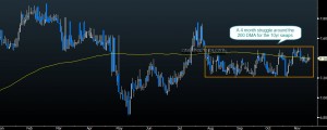
10 Year Swaps - Daily Charts

As is evident from the chart, there is still an intense struggle to cross the 200 DMA. AND when stock markets were trading near the all time high, the 10yr swaps were actually miles away from the peak made in February!  If stocks are that attractive why are investors still seeking the safety of fixed income?

I have for quite some time held that the continuation of this bull market is largely dependant on the debasement of the USD. Which was exactly why I had stressed the importance of staying  near the door of the bullish camp and having price objectives as opposed to a price target (see CNBC interview) on emerging markets, Gold, Silver and other asset classes. That brings us to the chart of the Dollar Index:
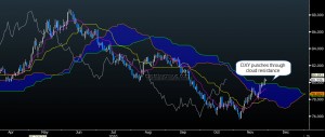
Dollar Index - Ichimoku charts

Not only has the Dollar Index reclaimed the key level of 80, it has also punched through the cloud resistance on its daily charts. If  my reading of the wave count here is correct, what we saw between QE2 day and Nov26th was just a milder part of the Dollar Index rally. The stronger portion of the rally has just about begun! ! (Remember the tight inverse correlation between emerging markets/commodities here and here?)

In 2010, emerging markets have had 2 significant corrections prior to November. One in Jan-Feb and the other one in Apr-May. The gross short interest in MSCI EM was 15% lower at November peak when compared with the January peak. That is a substantial level of complacency!!
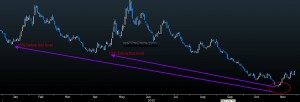
MSCI EM Gross short interest

Let us also look at Gold which can give us a fair idea of inflationary/deflationary pressures in the global economy.
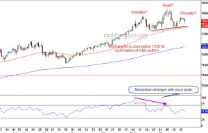
Gold Daily Charts - A potential H&S top?

The daily charts of Gold shows us that the swing to 1425 is in disagreement with the momentum readings. We can also see the potential for a Head and Shoulder top formation.  A close below the neckline, currently at 1340, is likely to augment further selling and a minimum drop to 1225 level is the expected outcome of such a breach.