Jai Bala will be on CNBC-TV18's "Bazaar" on 27th May 2011 between 8:30am and 9:10 am Indian Standard time to discuss market trends.
Just one day prior to the anniversary of Dow's 1000 point crash, the Ghosts of the 'flash crash' came back to haunt risk assets with greater ferocity. Crude got walloped by 10%, Gold got slammed by over $50 and Silver was decimated by another 12% on top of its recent sharp drop!!
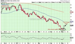
The force behind this move is the Dollar Index, which until now had refused to head higher despite being heavily oversold on multiple counts.
If you look the charts of UUP, the bullish dollar index fund, the 1.5% rise for this currency basket has come with a massive buildup in volumes. Also a gap up in UUP after a congestion holds the probability that the gains could stick and could even be a reversal. A follow through in Friday' session for the USD would bode well for those rare Dollar Bulls. One thing that is quite clear, if this is not the reversal for the green-back, whenever it occurs, what we saw in yesterday's session is a mere curtain-raiser of things to come for risk assets.
Looking at the charts of Gold and Crude, there is more evidence that this is probably a turn of high significance for the intermediate to long term.
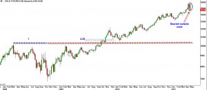
Gold: The weekly charts of Gold will end up being a bearish outside week (unless it recovers $40 in today's session) and this high probability reversal has occured at a very important time ratio as shown in the chart.
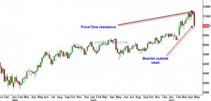
Crude: A bearish outside week in crude and Price/Time have squared at the high.
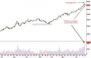
Silver's sharp decline after hitting a multi-decade high warrants close attention.
The daily chart of silver above marks the "long-legged doji" which is a key warning of sign of an impending reversal. Moreover this pattern (a) has occurred after a prolonged and parabolic rise in silver (b) has seen follow through selling on very heavy volumes and (c) has faced resistance at the 1980 highs. These are mouth-watering signs for much lower prices for silver.
However I will probe this set up with a very small short trade - the Dollar Index has shown no signs of reversal and is merely consolidating near the lows. Unless the green-back turns up this might turn out to be just a fleeting drop in an up-trend.
Reversal in Crude?
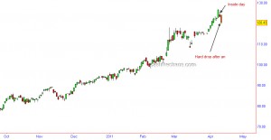
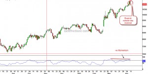
The daily charts of Nymex Crude registered a very important price action which could potentially mark a trend reversal. In technical parlance this is called a bearish outside day or a bearish engulfing candle.
Momentum readings have also diverged negatively with this occurrence and the number of contracts that accompanied this sell-off also ticked up (a nice to have). Now why should you pay attention to this? Besides the fact that the 2008 reversal was also a bearish outside day, I'm sure you would have heard and seen reports of $200+ crude over the last few weeks flying thick and fast. Essentially, it is a very crowded trade.
Now if crude does come down, do not be mislead into thinking that a falling crude may be the new impetus for stocks. If this is indeed a reversal for Crude, stocks are also likely to start a new downtrend or resume the previous down draft depending on which markets you are focussing on. Here is an interesting snippet regarding crude from one of my past interviews:
httpv://www.youtube.com/watch?v=hJuWU1GEYD0
As a reality check, let me also add that I do not see such a reversal in Brent Crude. It would have been another nice to have and would have added more weight to the reversal.
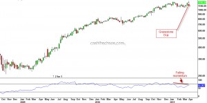
Last week, TCS hit new life time high on Tuesday but by the end of the week the stock closed under the previous high of 1220. The chart below is the weekly chart of TCS showing a 'gravestone doji' formation suggesting supply is starting to over-power demand. The bottom panel also shows momentum diverging negatively with the price movement.
Drilling down to it's daily chart, it is quite clear that when TCS clocked new highs, there was not any significant volume expansion. The stock was not able to sustain above it's previous high of 1220 for more than a day and has continued to move lower. This price action is looking more like a head-fake rather than a true breakout. Now, if you are a conservative trader, you can wait for the breach of 1125 to book out longs and reverse direction. An aggressive approach would be to turn bearish below last week's low of 1184 with a stop placement above 1220 or 1247.
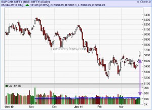
The 2.3% bump UP for the Nifty on Friday was quite smooth and brought a lot of cheer on the streets but the CRITICAL 5690 level still remains unconquered. Given the smart rise of the previous week, it may not seem formidable after all. Nevertheless, we will have to wait and see what the market does. So, let us do a what if scenario.
a) What if 5690 is taken out - the bullish case. The market structure that we thought was unravelling in this post would not be the case and markets would continue to head higher. The problem here is, the market has spent more days between 5600 and 5200 than it took to decline from 6182 to 5177. So it is looking more like a short-term bullish picture. And the question - How much higher? It could be around the region of 5900 but may not be much higher.
b) What if 5690 is not taken out - the bearish case. Obviously the old targets would still be alive while we may still have to see if we need to slightly review the market structure. But the markets need a quick decline - the longer Nifty holds above 5600, the odds of the bears losing advantage would increase.
A couple of things that needs to pointed out here. Firstly the volume of the short-term breakout did expand slightly, it was nothing exceptional as the media is projecting it to be (see the horizontal blue line on charts).
Secondly, while the small caps and mid-caps tend to follow the large caps, they are yet to clock higher highs - risk taking is not yet back, at-least so far.
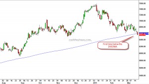
If you thought the key price action of last week's trading activity in the Indian bourses was Reliance's drop on Friday, that is not entirely true. The CNX IT index's steady price erosion over the last week is actually more important.
All through the corrective declines since the March 09 bottom, not once did this index drop below the 200 DMA. Yet another, sign that this is not a mere correction.
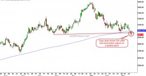
Infosys, the technology heavy weight has an interesting price chart.
The stock gapped below its 200 day moving average on Thursday and ended the week firmly below this level.
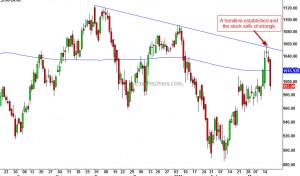
Reliance the stock on which the hope's of the bulls are pinned, established a firm downward sloping trendline and the stock has started to drop strongly.
While the talk of the week was the apparent resilience of the Indian market during a crisis , it was actually the bears who were scoring. This is the first time since 2008 that all the sectoral indices are trading below their respective 200 DMA!!
When earthquake/tsunami struck Japan on Friday, I'm sure you would have heard in the media how this was affecting the sentiments of the markets. Here are few things one must know :
Let us take a look at the powerful Kobe Earthquake that struck Japan in 1995 and caused $102.5 billion damage:
It is obvious from the chart that the Earthquake occurred during the down trend and did not create any reversal on its own.
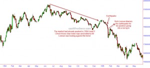
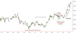
Now let us a look at the Latur Earthquake that left nearly 8000 dead in India and its impact on Sensex.
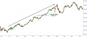
What about the Tsunami of 2004 that left 230,000 dead in Asia?
Looking at the charts, if one were to think no natural disaster occurred on Dec 26th 2004, he/she can be excused!!
The picture is similar even if one looked at the man-made disasters like Bomb blasts and terrorist attacks!
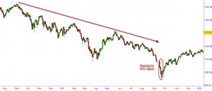
The infamous WTC attack:
While the reaction may have been pronounced, would it have mattered had it occured when the market trend was up?
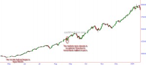
So let us look at markets reaction to mumbai serial blasts of August 2005:
So, the next time you hear someone on media say that such and such exogenous events is causing the markets to decline you might want give these charts a thought. While there might be initial knee jerk reactions, these events do not even cause short term reversals!!! All one has to know is, what is the trend.
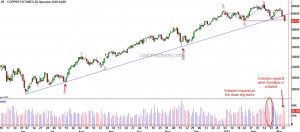
Copper, which is often considered a proxy for the global growth, dropped through some important support levels.
The intermediate term trendline from June lows, which was holding up this market, gave way along with expanding volumes. The move from June lows to the November highs is a clear 5 wave pattern and the 5th wave is also related to the 1st wave by a Fibonacci ratio - a normal ending wave relationship. Also noticeable on the charts is the volume expansion as the red metal declined from its February highs.
The blue dotted line shown on the charts could be considered as a Head and Shoulders top and the breach of 424 price level would become the breach of the neckline that completes this pattern.
Considering all the above evidences, it does look like the metallic professor is saying the winds of change are here for the global economy. Expect the S&P 500 to drop below 1294 swing low in the immediate future which in turn is likely to result in a larger decline.
