Jai

Aug 102011
 

The blame game begins 😀

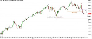
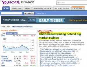
Did you ever doubt the movements in the stock markets over the last couple of weeks was not a bear market fluctuation? Here is proof that it is- the above headline captured from Yahoo/Reuters.

Wait a second. I thought fund managers never looked at charts. Wasn't it always their super intelligence and Ivy league education that drove their decision making process? You mean to say small guys who look at charts churned all those trillions of dollars of Market Cap across the globe and the fund managers just sat there and did nothing to prop up their NAV? No value buying? You mean to suggest that algorithmic trading do not take into account PE, Price to book and other parameters and just supports and resistance?

I've seen such Technical Analysis/ Chartist bashing in every bear market in the last 12 years. Having worked in an institutional broking arm in the past, I can tell you this - a technicians full worth is realised only in a bear market. The PE multiples, consensus forward earnings put forward by the leading broking arms are very rarely ever, leave alone being right, even close to being right. In a bullish environment these numbers give the illusion of being right. So when a bear market kicks in, the mirage disappears, everyone wants to speak to the chartist and understand where the markets are headed. Do you think I'm bashing fundamental analysis? Nope. Here is the proof.

Do you know what was the consensus earnings estimate in Jan-March 2008? It was close to 1000 for the sensex(check here and here). That number was revised down to 933 in Oct/Nov 2008 citing slowdown in economy (euphemism for I'm watching price action). Any guesses when that number was achieved? Now, HOLD YOUR BREATH!  And take care of your Jaw! We are yet to see that on Sensex!!!!! I'm not talking about the 1000, I'm talking about the revised number of 933. The BSE website shows the current earnings for the Sensex as 913!!!! The current forward earnings estimate for Sensex is around 1200. So the next time you hear markets are cheap compared to their earnings - you might want to think or ask "based on what? Trailing or Forward earnings?"

For fundamental analysis to be effective one must have an approach like that of Warren Buffett or the Chandler brothers who stay far far away from the action, observe, analyse the markets and pick value like a hawk.

Now do not get me wrong, I know some brilliant fundamental analysts in the industry who do not come up with silly numbers like cited above. But those guys are a very rare breed.(Example: So rare that one Fund manager made the CEO of Tata Power wait so that he could talk to an analyst friend of mine)
Aug 102011
 

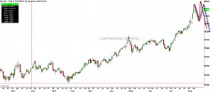
The up move in Gold is starting to look similar to what silver was in April. Yesterday's intraday high of 1782 and a much lower close is the first warning sign. This does not necessarily mean that Gold will start crumbling right away. In fact an erratic rise, like the two scenarios shown on the chart below would give traders an ideal shorting opportunity and would be a classic parabolic end.

Gold - Daily Charts

In Technical terms: This is an extended wave 5. Almost always when the extended moves ends, it will be followed by a VERY HARD drop.

The sentiment picture: Talk to anyone around you, they will tell you must be insane not to own gold. I've been seeing facebook status from wannabe analysts and public stating heads or tails Gold wins. That is your sentiment picture screaming that the boat is about to capsize.

So, it is absolutely essential to understand that this not the time to create new long positions in Gold. If you are already long, be ready to fold.

Aug 042011
 

The price action over the last few days have been quite significant. Many world indices have seen reversal in their major trend.

S&P 500:

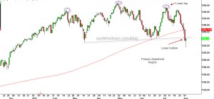
S&P 500 Daily Charts - Primary down trend

In my last post, I had warned that the S&P was poised to break the lows of June. Not only did that happen, the S&P took out the "Earthquake low" of March both on an intraday and closing basis. Some technicians might even make a case for a head and shoulders top for the S&P (see the violet ovals and the violet dotted line). Excluding the Nasdaq ,all other important indices -the transports, the industrials, Russell have also blown through their June lows and they all make a strong case for the start of a primary downtrend in the US markets.

FTSE:

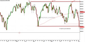
FTSE Index - Triple top

UK's FTSE index in a similar fashion has plunged through the June and "Earthquake lows". The close below 5650-5600 zone marks the completion of a triple top. Over the next few weeks and months one can expect this index to drop to about 5100.

French CAC:

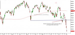
CAC 40 Daily Charts

The CAC 40 was first among the major European indices to drop below its major support and reverse into a primary downtrend. The Index is trading at a 11month and has found temporary support at the 3400 levels. Look for more selling pressure post a relief rally.

German DAX:

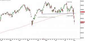
The German DAX though above the March low, has clocked a clearly identifiable lower tops and lower bottoms and thus has slipped into a clear primary downtrend. As a confirmation to this reversal, it is very likely that we will see a move below 6500 on the DAX in the short-term.

A noticeable uniform similarity in all these charts is that all the indices are trading far below their respective 200 day moving average (the red line). This is not a corrective behaviour, this is typical bear market behaviour. While EM and DM looked oversold and are likely to bounce in the next few sessions, one must not mistake the relief rally as the end of the correction. I, for one,  would look for signs of the contagion spreading. Its starting to look like 2008 for global stock markets.

Jul 192011
 

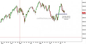
Yesterday's session for the US markets was an important one. If the fall from the May highs was corrective yesterday's low on the S&P 500 should have stayed above 1298. The fact that it did drop to 1296 is an indication the rally from the June lows was possibly an artificial rally manufactured by the powers that be. If you know a little bit of Elliott Wave you would know why this area should not have overlapped.

S&P 500 Daily Chart

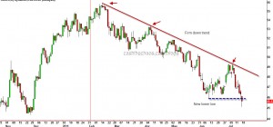
Also the Phily Banking index, nose dived below the June lows.

Philadelphia Banking Index

We already have a Dow theory non-confirmation in July - transports made a new high while the Industrials did not. So if these interpretations are correct, over the next few days we should see further down sides for the S&P which potentially could go below the June low of 1258.

Jul 112011
 

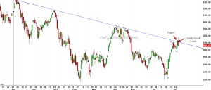
On Friday, India's benchmark Nifty saw some brisk selling and markets finished near the lows of the day. The selling pressure  reversed 75% of the previous session's gain and thereby producing the technical pattern known as "Dark Cloud Cover" (DCC) on the daily charts.

Nifty - Daily Chart

Questions that come up: (1) was Thursday's thrust above the medium trendline connecting through November_January highs a fake-out? (2) Is it going to beget further selling; (3) How does one position - buy the dip or sell the rip?

I wish the answers were plain and simple. The Nifty is in the midst of a very complex correction.  There are various ways to interpret the movement that has come off the June low of 5195. What is however clear, whether one is bullish or bearish is that, that a decline is under way and only the amplitude is in question. At 5735, wave v was equal to wave i (see chart for labelling), which is a normal ending relationship. So the high at 5740 was just 5 points over the ideal scenario. If the current decline continues beyond 5480-70 zone, the odds that the high at 5740 was a head-fake would increase. As long as Nifty holds this zone of 5480-70, I see this corrective rise having potential to make an attempt at more push higher which may end slightly above 5750 or fail at 5750.

If I were a nimble trader with 1-3 day time frame, I would trade banks and cap goods from the negative side. I were a conservative trader, I would stay very light until Nifty drops to 5480 or breaches 5750.

Jul 052011
 

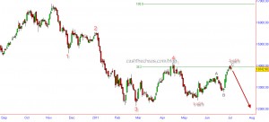
The chart below is the Elliot Wave structure of the BSE Capital goods sector:

BSE Cap Goods - Daily Chart with EW Count

The capital goods sector looks set for a sharp decline - potentially embarking on its 3rd sub-division of its 5th wave, which usually tends to be a powerful leg. The sector is also reacting from its 38.2% fibonacci retracement level of its decline from November to May. We would all recall that along with Banks this was a market leader on the way down from Nifty 6338 peak made last year. If my interpretation of the wave structure is right, we should see this index decline to about 12000 from its current level of 13842. The sector leader LT is reacting lower from its 50% Fibonacci retracement level and BHEL too, one of the weakest in this space, is about to establish a downward trendline. Look out below?

 Posted by at 3:16 am  Tagged with: ,
Jun 302011
 

I'm posting this update on Nifty from my holiday spot in Bangkok, so this will be short.

Nifty - Daily Charts

On the charts above, note those small violet squares (you may want to click on the chart for a zoom) that mark the swing highs and lows. This is how waves progress, each move moving beyond the extremes of the previous move and in a five step fashion. So, I'm treating the current move as a corrective move to the decline of 5944 to 5195 and not as a trend change. If you heard me on CNBC on 20th June, the day markets hit 5195, I had expected a reaction to 5485 but this one has been stronger than that. Nevertheless, it would have prepared you to go slow on the bearish side.

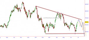
Going ahead, the rise from the June 20th low should remain "a three" for the bearish case. Hence, we should expect Nifty to start reacting lower from the red trendline marked on the chart (5720 and falling by 5 points each trading session) - which would raise the prospects of a descending triangle OR react lower from 5660's. Either case, I would NOT put my feet back on the bearish pedal atleast till I see a lower high registered. I have plotted a couple of possible routes on the chart.

Signing out, until my next update from Singapore - man, its really hot here!

Jun 142011
 

The Nifty has been in the range of 5600 to 5400 for the sixth week and has kept everyone guessing as to which way the range would resolve. As a good trader, one needs constantly play devil's advocate to your own views. So, here are the charts that present both the bullish and the bearish views.

If you are a bull:

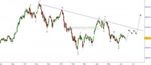
Nifty - Daily Charts - as the bulls would like to read

The above Elliot wave count assumes that the November high was only a portion of a larger bull run and further gains are yet to follow. The violet wave 1 ended at the November highs and the subsequent decline into the January lows of 5177 completed the corrective wave violet 2 (which sub divided as a zig-zag red ABC).  This would mean that the move to the May high was wave 1 green (impulsive)  and is part of the powerful wave 3 violet which is likely to reach levels way beyond the all time highs.

Line in sand - If Nifty dips below 5320 it would weaken the bullish case though only a breach of 5177 would completely negate this option.

What's in favour? - Despite the global and regional weakness, India has been holding up well in the last few days.

What's against? - Reliance and ONGC ,the two heavy weights, are showing weakness. A big negative pattern  is under construction in ONGC. The assumed wave count to the May highs is a truncation - which normally does not help the case. The blue dotted trend-line shown is also likely to place a lid on the upward move.

If you are a bear:

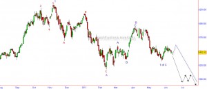
Nifty - Daily Chart - as the bears would like to read

The bearish case has multiple options and I have taken the least bearish option. If we assume the November high was the end of violet wave 1, the decline into the January lows was only part of a larger correction Violet A, that sub-divided into red ABC. The rise into May high is assumed as corrective in nature, Violet B (which again sub-divided as blue ABC). The ongoing move from the May high is part of the Violet C wave decline which is expected to sub divide in to 5 waves. Of this 5 waves we have probably completed the first wave of the decline (blue 1 of Purple C) and we are the beginning of a powerful wave 3 (blue 3 of purple C) that would take market below 5000 (black arrows) or the corrective wave 2 is yet to complete(blue dotted path) before the powerful blue 3 of purple C takes Nifty well below 5000.

Line in sand - A move above 5650 would weaken the bearish case though only a breach of 5944 would force us to suspend the bearish bets.

What's in favour? - Exactly what is against the bullish case favours this - ONGC and Reliance. Also, the Dollar Index seems set for a powerful move that is likely to unleash a destructive move on most risk assets across the globe.

What is against? - Nifty has not managed to consolidate on the advantage of taking out the March lows and move briskly below the January lows.

PS: If you would like to know which side i'm leaning - i've been on the bearish side since November and I continue to do so.

Jun 092011
 

The decline over the past few weeks has started to signal a top in some of the equity markets around the world. The Canadian TSX is one of those.

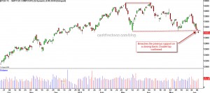
The chart above shows a confirmed double top for the Canadian TSX composite index. By conventional measuring techniques and by  Elliot wave principle this index should decline to 12300-11000 over the next several weeks from its current level of 13183.

The US S&P's decline below the April low is starting to resemble like the beginning of a powerful third wave. I expect a short-term bounce that relieves the oversold state and gets met with strong supply under 1311 S&P. If that happens expect the lows of  1248 (the post earthquake low ) to give way and the 1173-74 level will draw prices towards it. The next few days are key to this view.

Bottom Line: The global markets structure has started to weaken - The Russsian RTSI after a head and shoulder top in May is declining steadily; the Brazilian Bovespa has been clocking lower tops and lower bottoms since November just like the India Nifty (though this is marginally stronger in relative terms) ; the Shanghai Index too has been taking it on its chin since April.

 Posted by at 7:11 am